The sales funnel never worked: Measure sales velocity with Microsoft Power BI
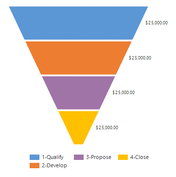
A lot of people use the sales funnel that Microsoft gives you out of the box, and we pretend (as we have for decades) that everything's great. But there are actually a lot of issues with that particular sales funnel chart (pictured below).

Four key issues are these:
- The sizes of the sections do not correspond with actual values. In the image above, every single value and stage has the exact same amount in it; but they have very different sizes and color in the different areas. So at one time, they are both the same and very different.
- The funnel analogy is incorrect. If you pour something into a funnel, everything comes out of the spout. The ones that exit the spout are the ones you win. But a real sales funnel is "broken," in the sense that some of your opportunities and leads drop out at every stage.
- As a result, you can't compare the sections by eyeballing them. You need to know more, like where are you losing deals, and, are you spending the time on the right opportunities?
- Finally, the funnel is a snapshot in time, not a view of your dynamic sales activity.
Power BI offers a new sales funnel chart that adjusts the size of the different stages (Qualify, Propose, Develop and Close) so you can visually compare them, which is different from the one that is out-of-the-box from Dynamics 365.

FREE Membership Required to View Full Content:
Joining MSDynamicsWorld.com gives you free, unlimited access to news, analysis, white papers, case studies, product brochures, and more. You can also receive periodic email newsletters with the latest relevant articles and content updates.
Learn more about us here