Lose the Noise: Shaping the World with Data Visualization
Imagine if you could shape the world around you based specifically on your needs, focusing only on the areas that have importance to your life and your business. Sounds nice, right? Well, by following some data visualization principles, you can.
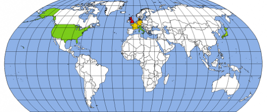
Data visualization within business intelligence helps communicate the facts in an efficient and compelling way. A good data visualization tool enables you to strip away all unnecessary noise and spotlight the most important data points. Personally, I'm particularly fascinated with Geographic Information Systems (GIS) data visualizations, which I often implement in my projects. Over the last few years, I have incorporated GIS into my research in finding new ways to un-complicate and unclutter business data, while sticking to a set of simple data visualization principles.
Position, Position, Position
"Location, location, location" has a power and meaning all of its own. You hear it over and over in the world of real estate. It also holds true in the data visualization world. But when it comes to data visualization, we refer to this principle as position, position, position.
When displaying data, the physical position of the data should be in an area that is easy for viewers to find and focus on. In addition, the position that each data point has in relation to one another is equally important. This gives the information you're trying to convey a greater chance to make an impact.
The Problem

Let's take a closer look at what I mean by data positions relative to one another. Here's the situation: Your company has markets, departments, or ...
FREE Membership Required to View Full Content:
Joining MSDynamicsWorld.com gives you free, unlimited access to news, analysis, white papers, case studies, product brochures, and more. You can also receive periodic email newsletters with the latest relevant articles and content updates.
Learn more about us here